The Motion Picture Negative (I): The Motion-Picture Camera, Film Stock and Color
ON FILM & DIGITAL · Technical article
The Motion Picture Negative
Part I: the motion-picture camera, film stock and color
By Ignacio Aguilar, AEC, cinematographer / director of photography
Spanish original: El Negativo Cinematográfico (I): la cámara de cine, la emulsión y el color
Before grain, latitude or the romance of celluloid, there is a machine: a camera moving film with absolute precision, frame by frame, while a light-sensitive emulsion receives the image.
For more than a century, the motion-picture image was the result of a very specific physical operation: a strip of light-sensitive film moving intermittently through a camera, being exposed one frame at a time through a lens, and later developed, printed, scanned or projected.
When we speak of the motion picture negative, we are not simply referring to a texture, a layer of grain or an “analog” look. We are referring to an entire capture system: camera, lens, gate, shutter, magazine, film stock, exposure, development and printing. Each part of that chain helps shape the final image.
Photographic film remains one of the most complex and decisive capture media in the history of cinema. Before the image became an electronic signal, a RAW file, a log curve or a set of values interpreted by a sensor, cinema was a chemical impression of light on a sensitive surface.
Note: it is also possible to shoot directly on positive or reversal film, such as Ektachrome or Kodachrome, with its own exposure and reproduction rules. In this series, unless otherwise stated, I will be referring primarily to negative film, because reversal shooting is now a very marginal practice in contemporary motion-picture production.
The Motion Picture Negative series
- Complete guide: camera, film stock, exposure, processing, scanning and 4K restoration
- Part I: the motion-picture camera, film stock and color
- Part II: format, film speed, film stocks and grain
- Part III: exposure, light metering, density and latitude
- Part IV: processing, printing and laboratory processes
- Part V: scanning, Digital Intermediate, 4K restoration and the contemporary workflow
The motion-picture camera: a precision mechanism
For decades, Mitchell cameras represented a standard of quality on film sets, with a movement and image stability that surpassed many cameras of their time. Panavision, especially after Mitchell declined and disappeared as an industrial force, inherited much of that position in the 1960s and 1970s. These American brands were less common in Europe, although they were present. On the European side, ARRI —particularly with the BL series from 1972 onward— and later manufacturers such as Moviecam in Austria and Aaton in France became essential references in different areas of production.
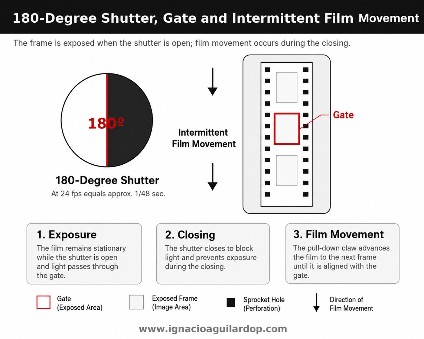
A celluloid motion-picture camera does not record a continuous signal. It records a succession of individual frames. To turn that succession into motion, the camera must pull the film down intermittently, stop it with precision in front of the gate, expose it for a fraction of a second and then move it to the next frame.
The principle is simple to describe but extremely demanding in practice. Image steadiness, vibration control, registration, gate adjustment, shutter angle, camera-body noise and the quality of the optical system all influence the cleanliness, sharpness and continuity of the recorded image.
Camera body, lens mount, viewfinder and gate
The camera body houses the film movement and exposure mechanism. It may be quiet enough for sync sound —as with the Arricam LT/ST— or louder and lighter —ARRI III, 235, 435— depending on the model and its intended use. In professional 35mm cinematography, the classical format was, for decades, 4-perf 35mm.
The lens mount secures the lens to the camera body. In modern cinema, the PL mount has been the most widespread standard, while the PV mount belongs to the Panavision ecosystem. Through the lens, light reaches the camera gate, where each frame is exposed.
The reflex viewfinder allows the operator to see through the lens. In reflex motion-picture cameras, part of the shutter system redirects the image to the viewfinder during the moments when the film is not being exposed. The operator is not looking at a final electronic image, but at an optical image used to frame, follow focus, judge composition and control movement.
The ground glass displays the framing marks: 1.37:1, 1.66:1, 1.85:1, 2.39:1 or other aspect ratios, depending on the project. Sometimes there may be double markings for different final framings. This guide is essential, because the negative may capture more image than will finally be projected or composed.
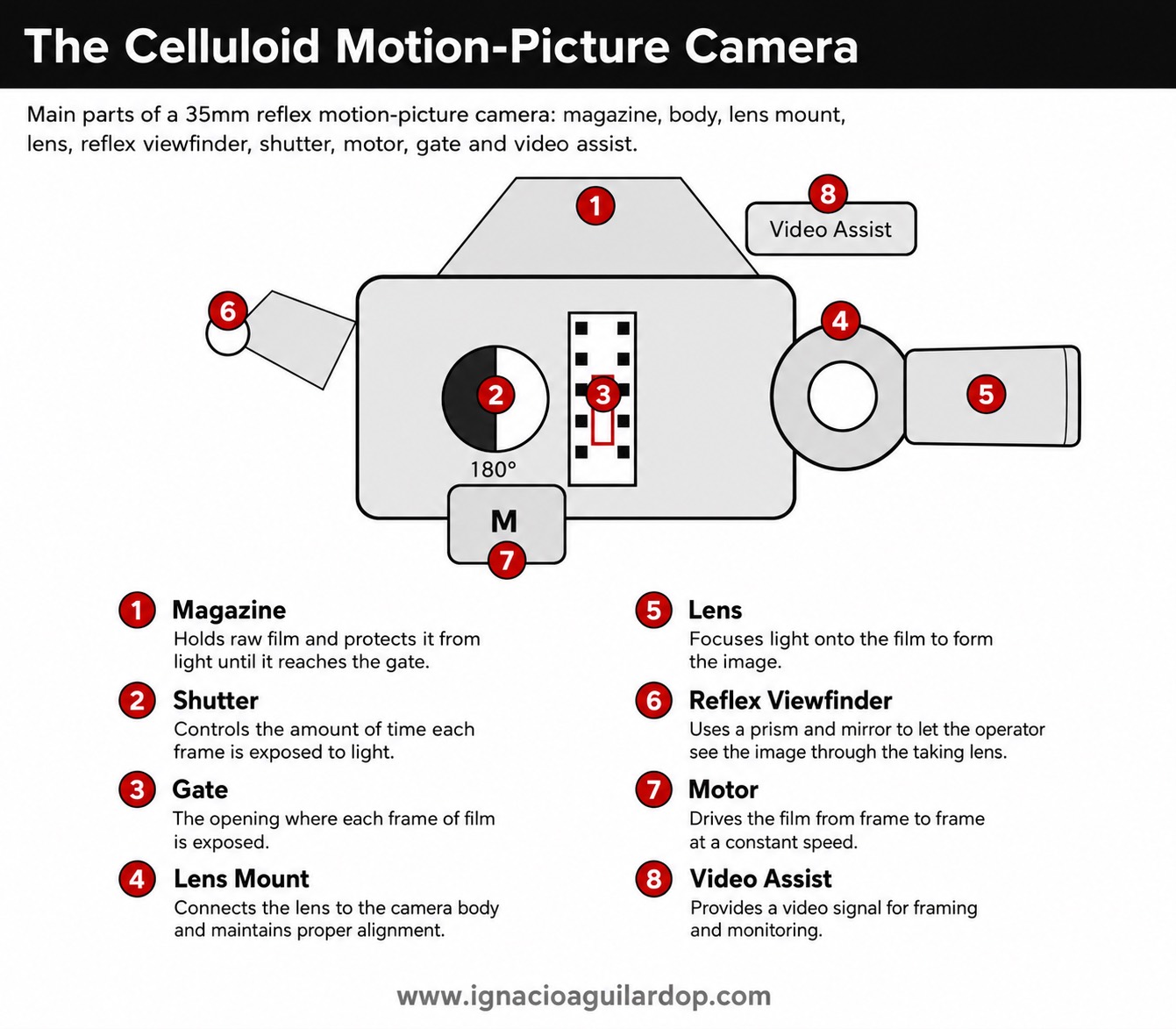
Shutter, motor and intermittent movement
The shutter controls how long each frame receives light. In cinema, the classical standard is usually a 180-degree shutter. At 24 frames per second, this corresponds to approximately 1/48 of a second per frame. If the shutter angle is reduced, exposure decreases and motion becomes more staccato or sharply defined —as in certain motion effects in Saving Private Ryan or Gladiator. If the angle is widened, exposure time increases and motion can acquire more smear.
The motor moves the film at the selected speed. In standard shooting, that means 24 frames per second, normally intended for projection at the same rate. But photochemical cinema also allows lower or higher camera speeds for fast motion, slow motion or specific movement effects. What matters is that the film must move with absolute precision: a small registration error can become image weave, vibration or instability.
A film-camera movement is therefore paradoxical. The film moves, stops, is exposed and moves again. In sound cinema, that operation has normally been repeated twenty-four times per second since synchronized sound established 24 fps as the production and projection standard around the turn of the 1930s.
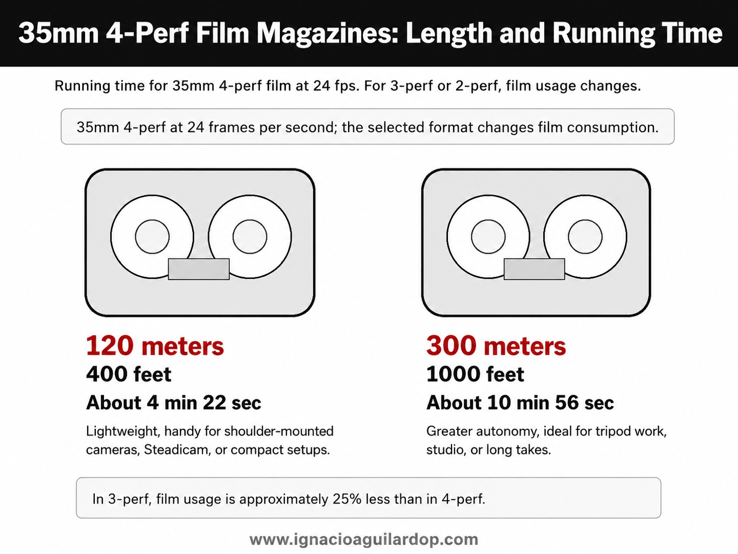
Film magazines, rolls and running time
The film magazine holds the unexposed roll and takes up the exposed negative. In 35mm 4-perf, the most common magazine sizes have traditionally been 120 meters —approximately 400 feet— and 300 meters —approximately 1000 feet. At 24 frames per second, a 120-meter load runs for about 4 minutes and 22 seconds, while a 300-meter load runs for about 10 minutes and 56 seconds.
This matters more than it may seem. Shooting on film means knowing how much negative remains, when the magazine must be changed, how long a take can run and what each additional take actually costs. Part of the discipline of photochemical production comes from that physical limit: negative is finite, expensive and must be handled carefully.
Video assist, accessories and monitoring
Many modern film cameras include video systems for monitoring the image. But one distinction is essential: video assist does not show the final photochemical image. It helps with framing, blocking, movement, focus and composition, but it does not replace the light meter or the cinematographer’s understanding of the stock.
Around the camera we add the other tools of production: lenses, matte boxes, neutral-density filters, polarizers, diffusion or color-correction filters, manual or wireless follow focus systems, shoulder rigs, tripods, heads, dollies, Steadicam, cranes and wireless video. The decisive element, however, remains the same: the negative that is going to receive the light.
Film stock: a medium for capturing light
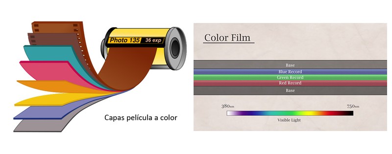
A motion-picture film stock is built from several light-sensitive layers, laid over a transparent base and protected by auxiliary coatings. In modern color negative, those layers respond to different areas of the visible spectrum and make it possible to reconstruct the chromatic information of the scene.
This is the essential difference between Eastmancolor, introduced commercially in 1950, and the earlier Technicolor “Three-Strip” process. Technicolor was far more expensive and labor-intensive because it used three black-and-white 35mm records, separated through the camera’s beam-splitter system, to reproduce a single full-color image. Eastmancolor simplified color cinematography by combining the color-sensitive layers within a single strip of film.
What light does to the emulsion
During exposure, light passes through the lens and chemically alters the photosensitive crystals contained in the emulsion. At that moment, the image is still invisible. Only after processing does a real negative image appear, with densities proportional to the amount of light each area of the frame received.
In practical terms, the more exposed an area of the negative is —for instance, a bright source inside the frame— the denser it will become after development. Highlights produce denser areas; shadows remain thinner. If the negative is too thin, with insufficient shadow information and inconsistent density, the final image may become weaker, more granular and less solid in the blacks.
The sensitive material in the emulsion is formed by silver halide crystals. When they receive enough light, they form a latent image that development turns into a visible one. In color negative, the chemical process ultimately creates a dye image, while the metallic silver is removed during bleaching and fixing. For that reason, visible grain in the final color image should be understood as part of the photochemical structure of the image, not simply as the literal presence of silver halides in the print.
To simplify: faster film stocks, such as 500T, need less light to reach a usable exposure, but they usually carry a more visible grain structure than slower stocks. With the same format, exposure, processing, scan and enlargement, a faster stock will tend to show more apparent grain than a slower one.
That relationship between exposure, density, speed and grain will be developed in the following parts of this series. For now, the key idea is simple: the negative does not record a final image. It records photochemical information that must later be interpreted.
The negative as origin, not final image
A digital image is usually evaluated from a monitor, even during the shoot, or through exposure tools built into the camera or monitor. Negative film forces a different way of thinking. For decades, the cinematographic image was not truly seen until development and the first work prints. Exposure was decided with a light meter, tests, experience and a precise understanding of each stock. The laboratory was central to the image-making process.
This separation between capture and final result is fundamental. The original camera negative —the Original Camera Negative, or OCN— contains the information photographed on set, but it is not necessarily the final look of the film. That look was traditionally built through development, photochemical printing and lab timing, and later through the Digital Intermediate, once negatives began to be scanned for digital color correction and visual effects.
Negative is therefore not simply an analog equivalent of a sensor. It is a capture medium with a particular response: its own tonal curve, a specific way of compressing highlights, a physical grain structure and a color reproduction that depends on chemical processes, not only on digital calculations.
Color temperature: tungsten and daylight
One essential difference between film negative and the contemporary digital camera is the relationship with color temperature. In digital cinematography, white balance can be selected with great flexibility: 3200K, 4300K, 5600K, 6500K or almost any point in between. With film, the stock is manufactured for a specific balance.
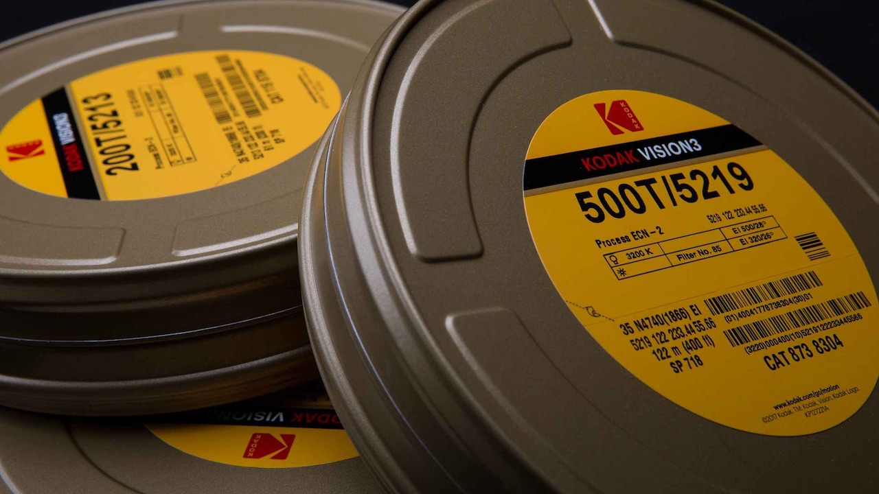
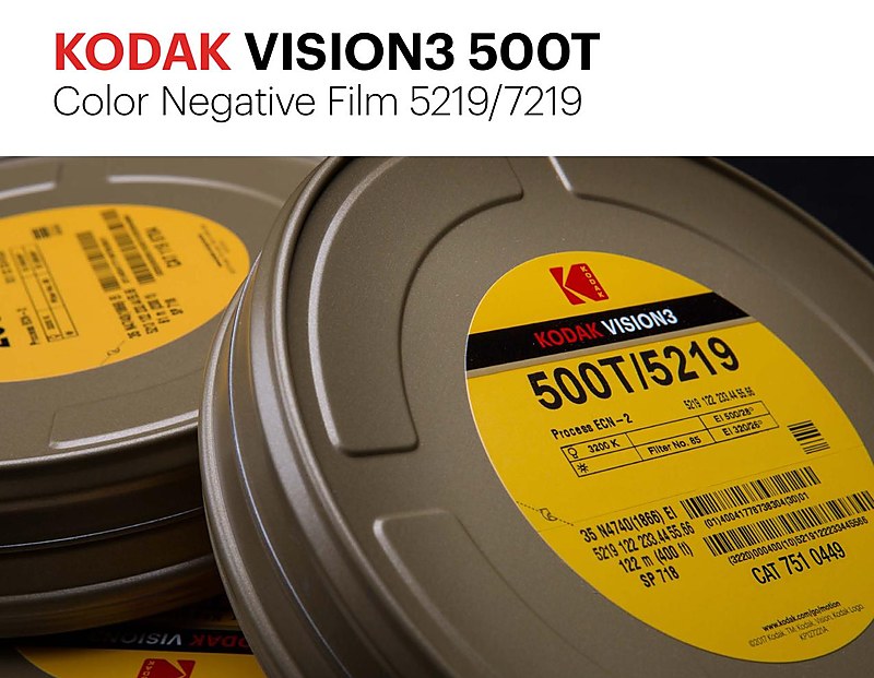
Color motion-picture stocks have traditionally been balanced either for tungsten —approximately 3200K— or for daylight —approximately 5500K. That is what the T and D designations mean: 500T is a 500 ASA tungsten-balanced stock; 250D is a 250 ASA daylight-balanced stock.
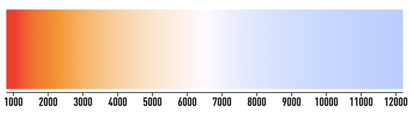
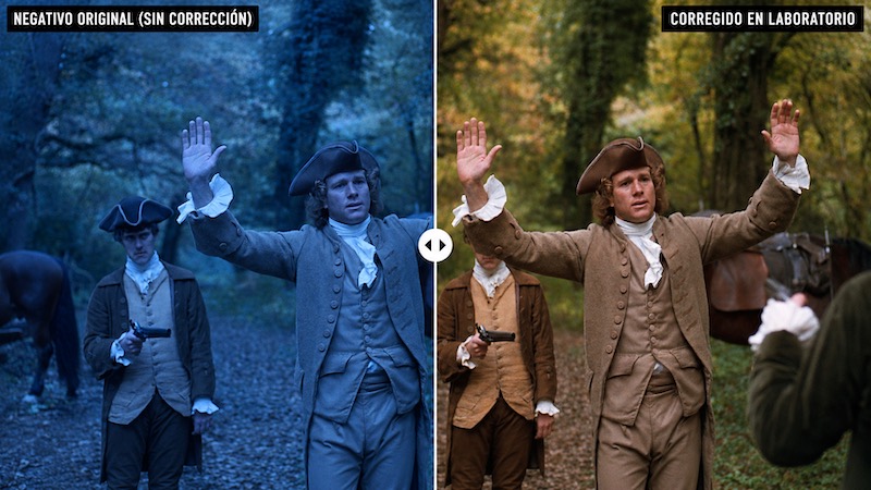
This characteristic has a deep effect on the image. A tungsten-balanced stock used in daylight without correction will tend to produce a blue image, because it is designed to interpret a much warmer source as white. Conversely, a daylight-balanced stock used under tungsten will render those sources as warm or orange.

Correction filters and color decisions
For decades, cinematographers controlled these shifts with conversion filters. The 85 or 85B filter allowed tungsten-balanced film to be used in daylight by correcting the excess blue; the 80 series performed the opposite conversion, cooling tungsten light for daylight-balanced film.
But these filters were not merely technical solutions. They could also become expressive decisions. Correcting partially, not correcting at all or mixing color temperatures was —and still is— a way of building atmosphere. A filter such as the 81EF, for example, could provide a partial warming correction while preserving some of the coolness of daylight on tungsten stock. That belongs to the language of photochemical cinematography: the goal was not only to neutralize the image, but to decide how much color bias should remain part of the scene.
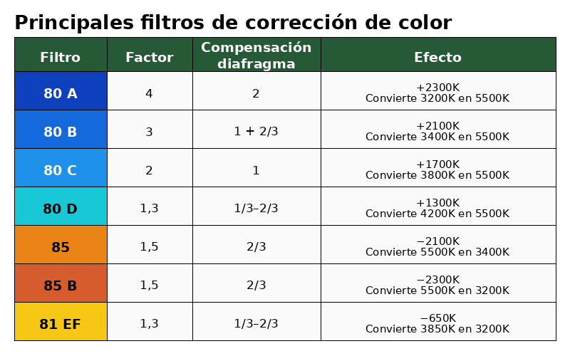
The problem with color filters is that they cost exposure. If you go outside with a 500T stock and use the correct conversion filter —85B— that filter costs approximately 2/3 of a stop. The usual solution is either to enter that filter factor into the meter or to adjust the effective EI by those 2/3 of a stop, working at roughly 320 ISO.
The reverse is rarely practical. Technically, you could load 250D and shoot a tungsten interior through an 80A filter for full correction, but that filter costs about two stops. The 250 ISO stock effectively becomes about 64 ISO. In most situations, that makes far less sense.
Laboratory correction and expressive color
There are also classic examples of leaving part of this correction to the laboratory. Barry Lyndon (1975) was shot entirely on a tungsten-balanced stock, Kodak 5254 100T, and John Alcott BSC avoided the 85B in day exteriors, allowing the blue bias to be corrected in printing. That preserved the full speed of the negative outdoors and, according to tests, could help produce richer greens.
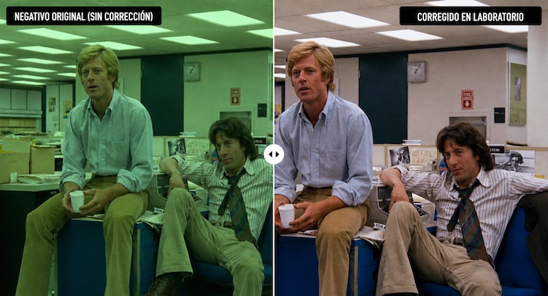
Excalibur (1981) used a similar logic, although with Kodak 5247. In All the President’s Men (1976), Gordon Willis ASC photographed the recreated Washington Post newsroom on a stage lit with conventional cool-white fluorescents, which carried a strong green component, and let the laboratory remove the excess green.
Many films were shot with neutral-looking exteriors and then given a warmer or cooler bias through photochemical timing. Others chose to imprint the bias in the negative itself. Michael Mann, for example, shot day exteriors in Heat (1995) deliberately on uncorrected 500T to create a cooler, bluer response at the point of capture.
The point is that the negative is only one stage of the photochemical image. The final look could be shaped in camera, through stock choice, through filters, through processing or through printing. There was no single correct way to neutralize the image. There was a technical chain that allowed decisions to be made.
In digital cinematography, these filters can still be used —and many cinematographers continue to use them— but the logic is different. Within normal color-temperature ranges, roughly 2800K to 6500K, it is usually more practical to adjust white balance in camera and reserve warming or cooling filters for expressive decisions, specific effects or deliberate color biases.
From the camera to exposure judgment
This first part has treated the negative from its starting point: the motion-picture camera, the film stock, the color layers and the color balance. But the real behavior of negative cannot be understood until exposure is considered.
The nominal ASA of a film stock is a manufacturer’s recommendation, not an absolute obligation. A cinematographer can choose to handle the same stock differently: overexpose it, underexpose it, push it, pull it or compensate later in printing or digital grading. That is where density, latitude, apparent grain, milky blacks, highlights, light meters, incident light, reflected light and exposure judgment enter the discussion.
The relationship between exposure, density, speed and grain continues across the next parts of this series. The second part addresses a prior question: how format, negative area, film speed and stock choice determine definition, texture and apparent grain. The third part then moves into exposure, light metering, density and latitude: the practical decisions that determine how the negative receives and organizes light.
Continue the series
Open the complete five-part guide
The Motion Picture Negative (II): format, film speed, film stocks and grain.
The Motion Picture Negative (III): exposure, light metering, density and latitude.
Sources and related reading
- Kodak VISION3 500T Color Negative Film 5219/7219. Source: Kodak Motion Picture.
- Current Kodak motion-picture film stocks. Source: Kodak Motion Picture Camera Films.
- Diagrams on the motion-picture camera, shutter and film magazines: author’s own material, adapted from teaching resources.
- Barry Lyndon, All the President’s Men, Excalibur and Heat: examples used to illustrate the relationship between film stock, color temperature, filters and laboratory correction.
ON FILM & DIGITAL © Ignacio Aguilar, AEC · 2026