The Motion Picture Negative (II): Format, Film Speed, Film Stocks and Grain
ON FILM & DIGITAL · Technical article
The Motion Picture Negative
Part II: format, film speed, film stocks and grain
By Ignacio Aguilar, AEC, cinematographer
Spanish original: El Negativo Cinematográfico (II): formato, sensibilidad, emulsiones y grano
The texture of the motion-picture negative is not determined by film stock alone. Format size, film speed, exposed negative area and enlargement all shape the grain, definition and physical presence of the image.
In the first part of this series, we looked at the motion-picture camera, photographic emulsion and the relationship between negative film, color temperature and correction filters. But the negative cannot be understood only as a strip of light-sensitive material. Each format uses a different image area, each stock has a specific speed, and every combination of format, exposure, processing and enlargement produces a different presence of grain.
That is why two films shot on celluloid can look radically different. A feature shot on Super 16mm does not behave like one shot on 35mm anamorphic, VistaVision or 65mm. A slow 50 ASA stock does not behave like a fast 500 ASA stock. The photochemical image is born from the relationship between support, speed, optics, exposure and process.
Series: The Motion Picture Negative
- Part I: the motion-picture camera, film stock and color
- Part II: format, film speed, film stocks and grain
- Part III: exposure, light metering, density and latitude
- Part IV: processing, printing, Digital Intermediate and special laboratory processes
Format, negative area and perceived grain
The motion-picture negative is not a single homogeneous medium. Throughout film history, many formats have been used: 8mm, Super 8, 16mm, Super 16, 35mm, Super 35, VistaVision, 65mm, 70mm and IMAX 15/70, among others. The classical industrial standard was 4-perf 35mm, but every format implies a different negative area and therefore a different relationship between definition, grain, optics and enlargement.
The larger the image area on the negative, the less enlargement is needed to reach a print or a final master. That is why the same stock can show very different grain in 16mm, 35mm, VistaVision or 65mm. 16mm can bring a more nervous, immediate and textured quality; 35mm holds the classical balance between photogenic texture and definition; 65mm moves the image toward a very different kind of cleanliness, stability and depth.
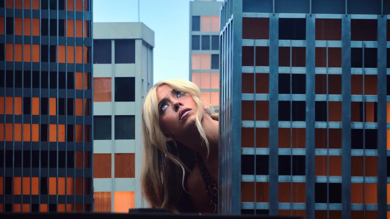
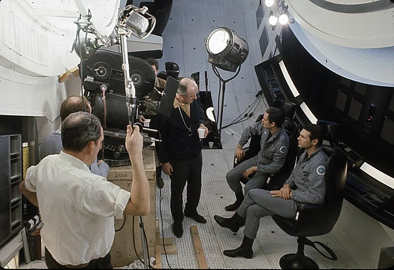
In other words, under equal conditions —the same light, stock, exposure, scan and finish— a larger negative area will usually produce a more refined image. The jump from 16mm to 35mm is very visible, as is the jump from 35mm to VistaVision, and especially from 35mm to 65mm or IMAX. Still, the industrial standard for film production was almost always 35mm or Super 35. Relatively few features were shot in 16mm, and far fewer in larger formats. Films such as Ben-Hur (1959), Lawrence of Arabia (1962), Cleopatra (1963), 2001: A Space Odyssey (1968), Airport (1970) and Ryan’s Daughter (1970) remain useful examples of that classical large-format period.
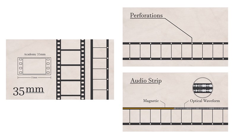
It is important to distinguish camera negative from exhibition print. The original camera negative did not contain sound, but the release print had to reserve space for an optical or magnetic soundtrack. This is why terms such as Super 16 or Super 35 indicate a different use of the available film area: the sound area is removed and a larger part of the frame is used for image.
Beyond Super 35 —35mm wide, four perforations per frame— there are larger systems such as VistaVision, which runs 35mm horizontally over eight perforations; 5-perf 65mm, used for systems such as Todd-AO and Super Panavision 70; and the enormous IMAX 15/70 format, which runs 65mm horizontally over fifteen perforations per frame, with a negative area roughly three times that of conventional 65mm.
Related reading on Film Formats
To avoid repeating the whole history of formats here, this section connects with the specific ON FILM & DIGITAL Film Formats series:
- Film Formats (I): 35mm, Silent Cinema, Sound and Technicolor
- Film Formats (II): Cinerama, CinemaScope and Panavision
- Film Formats (III): Academy, VistaVision and 70mm
- Film Formats (IV): Technirama, Techniscope and IMAX
- Full-Frame Cinema: A Practical Guide to Large Format and VistaVision
- The anamorphic format in cinema: a practical guide
Film speed: ASA, ISO, EI and the need for light
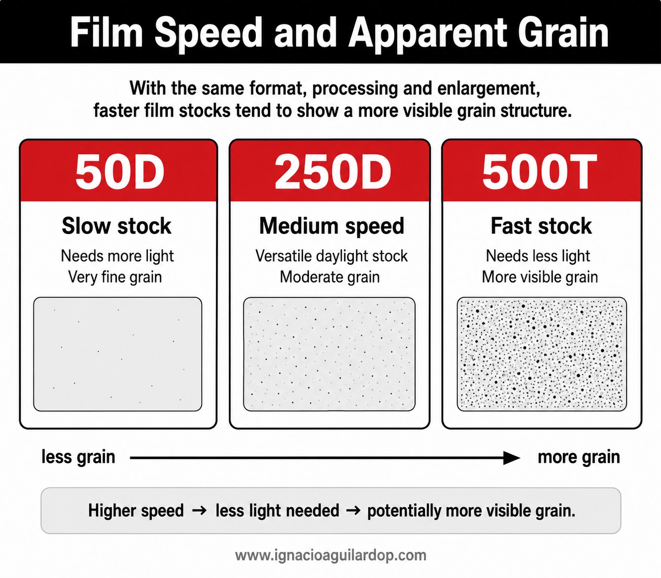
Another essential characteristic of a film stock is its speed, expressed historically as ASA, ISO or EI. In practical terms, a faster stock needs less light to expose the negative correctly. But that advantage has visual consequences. Faster stocks tend to show a more visible grain structure, while slower stocks usually produce a cleaner, finer and more sharply defined image.
Part of film history can be read as a history of increasing speed. For decades, the low ASA of color stocks shaped the amount of light required, the possible depth of field, the size of lighting units and the way cinematographers approached interiors and night scenes. The gradual increase in speed opened the image to lower light levels, more natural spaces and a broader range of expressive choices.
The following table shows that until 1981, color motion-picture stocks generally reached only 100 ASA. It was not until that year that the first 250 ASA stocks appeared —Fuji arriving before Kodak— followed quickly by 400 and 500 ASA stocks toward the end of the 1980s. Since then, manufacturers have focused less on increasing speed and more on refining grain, latitude and character. In principle, a contemporary 500 ASA stock should be significantly better than one from the 1980s or 1990s.
In modern color negative, Kodak VISION3 has maintained a familiar range for years: 50D (5203), 200T (5213), 250D (5207) and 500T (5219). Each stock occupies a different place in the cinematographer’s work. 50D is slow, very fine-grained and intended for day exteriors or situations with abundant light. 500T has long been the reference stock for interiors, nights and lower-light situations. Between them, 200T and 250D provide intermediate solutions for mixed conditions.
When choosing stocks, there have traditionally been two schools of thought:
- The more common classical approach is to choose at least two negatives —one medium-speed stock and one 500T— and use them according to the light. If there is enough light, use the slower stock. It will usually give less grain on screen and a somewhat cleaner image, reserving 500T for night interiors, night exteriors or very low-light scenes.
- The other school, with John Seale [ASC, ACS] —the Australian cinematographer of The English Patient, Rain Man and Cold Mountain— as perhaps its clearest example, is to choose a 500T stock and shoot the whole film on it. The reasons are practical and visual: fewer magazine changes, less room for stock errors, and a more unified negative across the whole production. The price is more ND filtration outdoors and a darker viewfinder for the operator. Today, many people who choose film also want it to be visible. In that context, a more textured stock can be part of the appeal.
The VISION3 family began to appear from 2007, with 5219 500T, and was later completed with 5207, 5213 and 5203, always with a clear orientation toward capturing as much information as possible for scanning. They are therefore relatively moderate in contrast and saturation; the final look is shaped through exposure, processing and digital color grading.
Earlier film history offered a wider range of personalities. Kodak —Expression 5284 and 5229, as well as 5277 and 5287—, Agfa —XT320, used on titles such as Out of Africa— and Fuji —Reala 500D and ETERNA 8583 400T, among others— all provided lower-contrast or lower-saturation options. Fuji also offered two Vivid stocks, 160T (8543) and 500T (8547), built around high contrast and high saturation. Kodak VISION 500T 5279, widely used in the 1990s and early 2000s, also had a stronger contrast profile, with dense blacks and vivid color.
Fuji’s early presence in Hollywood is also worth remembering. John A. Alonzo [ASC] shot Farewell, My Lovely (Dick Richards, 1975) on Fujicolor, before Fujicolor A 250T 8518, introduced around 1980, helped establish Fuji as a fast, international alternative to Kodak’s dominance.
In other words, stocks are not defined only by tungsten/daylight balance or by speed. They also can —and historically often did— offer distinct looks, especially when combined with exposure and laboratory practice. Within the same brand, or by moving from one brand to another, the differences could be significant. In broad terms, Agfa tended toward softness, lower contrast and a relatively grainier response; Fuji often leaned cooler or greener; Kodak was generally warmer.
In April 2026, Kodak announced VERITA 200D 5206/7206, a new daylight-balanced color negative available by special order in 65mm, 35mm and 16mm. Developed in close collaboration with Sam Levinson and cinematographer Marcell Rév, HCA, ASC, for the third season of Euphoria, Kodak describes it as a more saturated stock, with deeper blacks, warm natural skin tones and a shorter dynamic range than VISION3. In practical terms, it suggests more built-in character than VISION3, perhaps closer —in a very broad sense— to the punch of reversal film. That is significant because the second season of Euphoria was shot on Ektachrome 100D.
Note: 35mm and 65mm Kodak motion-picture stocks use codes beginning with “5.” 8mm and 16mm stocks begin with “7”: 7203, 7207, 7213, 7219 and 7206. Kodak Double-X 5222/7222 also remains in use, a long-running black-and-white negative. Kodak manufactured a 65mm version of Double-X for the black-and-white sections of Oppenheimer; Schindler’s List remains another essential example of black-and-white photochemical cinematography in 35mm.
The current range of motion-picture film is far narrower than it was during the classical industrial period, when more manufacturers, speeds and contrast variations coexisted. Kodak remains the main reference for color negative motion-picture film, while ORWO has reintroduced or maintained certain motion-picture film stocks, especially in color and black and white. Even so, the current film ecosystem is more specialized, more deliberate and more dependent on labs, scanning and hybrid workflows than in the past.
The continuing relevance of negative
Today, motion-picture negative occupies a different place than it did for most of the twentieth century. It is no longer the unavoidable industrial standard. It is a conscious choice. Shooting on film means cost, logistics, laboratory work, scanning and a different discipline on set. Precisely for that reason, its use today is usually tied to a clear aesthetic intention.
The traditional photochemical process —shooting negative and releasing positive prints without scanning or digital manipulation— has largely been replaced by a hybrid photochemical/digital workflow: negative → 2K/4K scan → Digital Intermediate —digital grading and VFX— → digital master. Once the negative is scanned, it enters a workflow very similar to that of a digital camera file, even if its origin remains photochemical.
This workflow, which avoids multiple generations of traditional printing, has made 16mm look better than ever. That is one reason for its current resurgence: it combines an unmistakably photochemical texture with a lower cost than 35mm. At the other end, the need to compete with streaming platforms has also helped revive larger formats in major productions. 65mm and IMAX can offer a film look with a level of cleanliness often associated with digital capture. Dunkirk, Tenet, Oppenheimer and Sinners are good examples of that tendency.
The contemporary interest in negative does not come only from nostalgia. It comes from behavior: how negative receives light, how it holds highlights, how its colors build density, how grain remains physically present, how one frame differs subtly from the next. Even after scanning and digital grading, negative carries a material trace that remains different from a purely digital image.
Negative is not better or worse than digital. That would be too simple. But it is not merely an imperfection or a postproduction filter either. It is a medium with its own internal logic. Understanding that logic is still useful even for cinematographers who may never shoot a single foot of film. Much contemporary image-making —including digital cinematography— still measures beauty, texture and tonal response against the memory of the motion-picture negative.
Reference table: as a closing tool, the following table summarizes some of the main Kodak, Fuji and Agfa motion-picture stocks from the period immediately before 1960 to the present. It is not meant to be a complete catalog, but a historical and visual guide to speeds, codes and image character.
| Code / name | Years / availability | Balance / speed | Main characteristics |
|---|---|---|---|
| Kodak — color negative 35mm | |||
| 5248 EASTMAN Color Negative | 1952/1953 → approx. 1959/1960 |
25T | Grain: Fine · Contrast: Medium · Saturation: Medium Classic Eastmancolor before the shift to 50 ASA stocks; it can still be associated with productions from 1959–1960. |
| 5250 EASTMAN Color Negative | 1959 → 1962 |
50T / 32D | Grain: Fine / medium · Contrast: Medium · Saturation: Medium A transitional 50 ASA stock; useful when distinguishing between 25T and 50T use in some 1959–1960 titles. |
| 5251 EASTMAN Color Negative | 1962 → 1968 |
50T | Grain: Fine · Contrast: Medium · Saturation: Medium A slow color negative stock. Classical, relatively soft image with improved structure over 5250. |
| 5254 EASTMAN Color Negative | 1968 → 1977 |
100T | Grain: Fine / medium · Contrast: Medium · Saturation: Medium The major standard of the late 1960s and first half of the 1970s. Balanced and still relatively clean for its period. |
| 5247 EASTMAN Color Negative II | 1974 / 1976 → c. 1994 |
100T / 64D; later approx. 125T | Grain: Fine / medium · Contrast: Medium-high · Saturation: Medium-high ECN-2. Sharper and finer than 5254, with relatively solid blacks and a firmer color response than later low-saturation negatives. |
| 5293 EASTMAN Color High Speed Negative | 1982 → 1983 |
250T | Grain: Medium-high · Contrast: Medium · Saturation: Medium Kodak’s first significant move toward higher-speed color negative stocks; a very short commercial life. |
| 5294 EASTMAN Color High Speed Negative | 1983 → approx. 1986 |
400T | Grain: High / medium-high · Contrast: Medium · Saturation: Medium A fast 1980s stock, grainier than later generations. Not to be confused with the current Ektachrome 100D 5294. |
| 5295 EASTMAN Color High Speed SA Negative | 1986 → c. early 1990s |
400T | Grain: Medium-high · Contrast: Medium · Saturation: Medium A Special Applications version, particularly associated with blue/green separation and effects work. |
| 5297 EASTMAN Color High Speed Daylight Negative | 1986 → approx. 1997 |
250D | Grain: Medium · Contrast: Medium · Saturation: Medium A fast daylight stock before the EXR/VISION consolidation; useful for exteriors with lower light levels or daylight-balanced interiors. |
| 5245 EASTMAN EXR 50D | 1989 → 2006 |
50D | Grain: Very fine · Contrast: Medium · Saturation: Medium-high A very fine, clean and crisp daylight film stock; one of the great choices for day exteriors and maximum apparent definition in 35mm. |
| 5248 EASTMAN EXR 100T | 1989 / 1990 → approx. 2005 |
100T | Grain: Fine · Contrast: Medium · Saturation: Medium A fine-grained, very clean tungsten negative stock and an important 1990s option. It complemented 5245, 5293 and 5298 when more light was available or when greater sharpness and refinement were desired. |
| 5296 EASTMAN EXR 500T | 1989 → 1995 |
500T | Grain: High / medium-high · Contrast: Medium · Saturation: Medium The first major EXR 500T. Much more usable than the earlier 400T stocks, but visibly grainier than 5298, 5279 or 5218. |
| 5293 EASTMAN EXR 200T | 1992 → 2004 |
200T | Grain: Low / medium · Contrast: Medium · Saturation: Medium An intermediate tungsten stock within the EXR family; Kodak described its grain structure as similar to 5248. |
| 5298 EASTMAN EXR 500T | 1994 → 2003 |
500T | Grain: Medium-high · Contrast: Medium · Saturation: Medium A more refined 500T than 5296; a bridge toward the VISION look of the late 1990s. |
| 5287 EASTMAN EXR 200T Ultra Latitude | 1994 → 1996 |
200T | Grain: Low / medium · Contrast: Low-medium · Saturation: Medium-low A wider-latitude stock with a softer contrast response. Useful when holding highlights and shadows without excessive hardness. |
| 5277 KODAK VISION 320T | 1996 → 2005 |
320T | Grain: Medium-low · Contrast: Low · Saturation: Low-medium A softer, more pastel VISION look; very flexible, with broad latitude and less aggressive blacks than 5279. |
| 5279 KODAK VISION 500T | 1996 → approx. 2006 |
500T | Grain: Medium · Contrast: Medium-high · Saturation: Medium-high Rich blacks, clean whites and vivid color. One of Kodak’s more characterful stocks of the late 1990s and early 2000s. |
| 5246 KODAK VISION 250D | 1997 → 2005 |
250D | Grain: Low · Contrast: Medium · Saturation: Medium A daylight member of the VISION family: clean and relatively natural, less extreme than 5245 but highly versatile. |
| 5274 KODAK VISION 200T | 1997 → approx. 2006 |
200T | Grain: Low / medium · Contrast: Medium · Saturation: Medium An intermediate tungsten member of the first VISION family. Faster and more flexible than a 100T stock, but less grainy than the 500T stocks. |
| 5289 KODAK VISION 800T | 1998 → approx. 2004 |
800T | Grain: Medium-high / high · Contrast: Medium · Saturation: Medium A very high-speed tungsten stock for extremely low-light situations. Very useful, but with a more visible texture than the 500T stocks. |
| 5284 KODAK VISION Expression 500T | 2001 → approx. 2003 / 2004 |
500T | Grain: Medium · Contrast: Low · Saturation: Low High speed with softer color, lower saturation and lower contrast. It precedes VISION2 Expression 5229. |
| 5263 KODAK VISION 500T | 2002 → 2003 |
500T | Grain: Medium · Contrast: Medium · Saturation: Medium A very short-lived transitional 500T within the VISION family, immediately before the consolidation of VISION2 5218. |
| 5218 KODAK VISION2 500T | 2002 → approx. 2009 |
500T | Grain: Medium-low · Contrast: Low-medium · Saturation: Medium The first VISION2 500T. Lower grain, improved scanning/transfer behavior and a cleaner image for the DI era. |
| 5229 KODAK VISION2 Expression 500T | 2003 → 2010 |
500T | Grain: Medium · Contrast: Low · Saturation: Low Kodak’s modern low-contrast, low-saturation option: soft skin tones, open shadows and a highly moldable response. |
| 5205 KODAK VISION2 250D | 2004 → approx. 2009 |
250D | Grain: Low · Contrast: Low-medium · Saturation: Medium A medium-speed daylight stock for DI workflows; natural color, good latitude and stable highlight/shadow detail. |
| 5212 KODAK VISION2 100T | 2004 → 2010 |
100T | Grain: Very fine · Contrast: Low-medium · Saturation: Medium The 100T stock of the VISION2 family: very clean, fine-grained and designed for the photochemical-digital workflow of the DI era. |
| 5217 KODAK VISION2 200T | 2004 → 2010 |
200T | Grain: Low · Contrast: Low-medium · Saturation: Medium A clean, flexible medium-speed tungsten stock; less grainy than 500T when interiors had enough light. |
| 5201 KODAK VISION2 50D | 2005 → 2012 |
50D | Grain: Very fine · Contrast: Low-medium · Saturation: Medium A slow, very clean daylight stock in the VISION2 family, designed for day exteriors, high definition and maximum grain refinement before VISION3 50D. |
| 5219 KODAK VISION3 500T | 2007 → Current |
500T | Grain: Medium-low · Contrast: Low-medium · Saturation: Medium The contemporary reference 500T. Wide latitude, better-controlled shadow grain and a large margin for scanning and DI work. |
| 5207 KODAK VISION3 250D | 2009 → Current |
250D | Grain: Low · Contrast: Low-medium · Saturation: Medium The current medium daylight stock: versatile, natural on skin, good color and restrained grain. |
| 5213 KODAK VISION3 200T | 2010 → Current |
200T | Grain: Very fine / low · Contrast: Low-medium · Saturation: Medium The current medium-speed tungsten stock. Kodak positions it with an image structure close to a 100 ASA stock and the versatility of 200. |
| 5203 KODAK VISION3 50D | 2011 → Current |
50D | Grain: Very fine · Contrast: Medium · Saturation: Medium-high The cleanest color negative in the current Kodak line; ideal for day exteriors and maximum apparent sharpness. |
| 5206 KODAK VERITA 200D | 2026 → Current / special order |
200D | Grain: Low / medium · Contrast: Medium-high · Saturation: High A new daylight negative with a stronger personality: more saturated color, warmer skin, deeper blacks and a shorter dynamic range than VISION3. |
| Fuji — color negative 35mm | |||
| Fujicolor 1970s Fuji color negative | c. 1970s → transition to the A series |
approx. 100/125T | Grain: Medium · Contrast: Medium · Saturation: Medium Early use outside Japan; John A. Alonzo [ASC] used Fujicolor on Farewell, My Lovely (1975) to separate it visually from Chinatown. |
| 8517 Fujicolor Negative A 100T | 1981 → approx. 1983 |
100T | Grain: Low / medium · Contrast: Medium · Saturation: Medium The first modern phase of Fuji’s A series: a low/medium-speed tungsten alternative before Fuji’s fast stocks gained wider international traction. |
| 8518 Fujicolor Negative A 250T | 1980 / 1981 → approx. 1983 |
250T | Grain: Medium · Contrast: Medium · Saturation: Medium A key film stock: a fast and competitive 250T at a moment when Kodak still relied heavily on 5247 as the production standard. |
| 8514 Fujicolor AX 500T | 1984 → c. late 1980s |
500T | Grain: Medium-high · Contrast: Medium · Saturation: Medium An early-1980s high-speed Fuji stock. More visibly textured than the later ETERNA line, but important for interiors and low-light work. |
| 8560 F-Series F-250D | 1988 → c. late 1990s |
250D | Grain: Medium · Contrast: Medium · Saturation: Medium Pre-Super-F/ETERNA daylight family. Often described in practice as slightly cooler/greener than Kodak. |
| 8570 F-Series F-500T | 1988 → c. late 1990s |
500T | Grain: Medium-high · Contrast: Medium · Saturation: Medium A high-speed Fuji stock of the late 1980s/1990s; more visibly textured than ETERNA, with its own chromatic character. |
| 8582 Super-F F-400T | 1999 → c. 2005 / replaced |
400T | Grain: Medium · Contrast: Low-medium · Saturation: Medium-low One of the Fuji stocks most associated with lower contrast and restrained color; with the right exposure and processing, it could approach Agfa territory. |
| 8592 Reala 500D | 2001 → 2011 |
500D | Grain: Medium · Contrast: Low-medium · Saturation: Medium-low A very fast daylight stock with a fourth color layer; distinctive because of its 500 ASA daylight balance. |
| 8573 ETERNA 500T | 2004 → 2013 |
500T | Grain: Medium-low · Contrast: Low-medium · Saturation: Medium-low A soft, natural ETERNA stock with pleasant skin tones and broad latitude. One of Fuji’s most common alternatives to Kodak VISION2/VISION3. |
| 8583 ETERNA 400T | 2005 → 2011 |
400T | Grain: Medium-low · Contrast: Low-medium · Saturation: Medium-low Relatively low saturation and controlled contrast; a 400 ASA alternative with less aggressiveness than the Fuji Vivid stocks. |
| 8553 ETERNA 250T | 2006 → 2013 |
250T | Grain: Low · Contrast: Low-medium · Saturation: Medium-low A medium-speed tungsten stock with a clean, soft image; well suited to interiors with enough light. |
| 8563 ETERNA 250D | 2006 → 2013 |
250D | Grain: Low · Contrast: Low-medium · Saturation: Medium The medium daylight ETERNA stock; softer than Kodak 5245/5203 and less saturated than the Vivid stocks. |
| 8543 ETERNA Vivid 160T | 2007 → 2013 |
160T | Grain: Low · Contrast: High · Saturation: High Vivid: high contrast, high saturation, strong colors and firmer blacks. The opposite response to soft ETERNA. |
| 8547 ETERNA Vivid 500T | 2009 → 2013 |
500T | Grain: Medium · Contrast: High · Saturation: High The fast Vivid stock: higher contrast, saturated color and deeper blacks, with more personality than standard ETERNA 500T. |
| 8546 ETERNA Vivid 250D | 2010 → 2013 |
250D | Grain: Low · Contrast: High · Saturation: High Daylight Vivid: stronger color, higher contrast and crisper blacks than ETERNA 250D. |
| Agfa — color negative 35mm | |||
| XT100 | c. late 1980s / 1992 → c. 1994–95 |
100T | Grain: Low · Contrast: Low-medium · Saturation: Low-medium A soft, less saturated stock than Kodak, associated with browns, greens, blues and restrained contrast. |
| XTR250 | c. 1992–93 → c. 1994–95 |
250T | Grain: Medium-low · Contrast: Low-medium · Saturation: Low-medium A short-lived replacement for XT320, according to professional accounts; highly valued for its softness and brief commercial life. |
| XT320 | 1985 → approx. 1995 |
320T | Grain: Medium · Contrast: Low · Saturation: Low-medium Agfa’s best-known color negative: low contrast, broad latitude, less saturated color and controlled grain for its speed when generously exposed. Associated with titles such as Out of Africa (1985) and, in combination with Kodak, Robin Hood: Prince of Thieves (1991). |
| XTS400 | c. early 1990s → c. 1994–95 |
400T | Grain: Medium-high · Contrast: Low-medium · Saturation: Low-medium A faster member of the XT/XTS family; it keeps Agfa’s soft-contrast tendency, with more visible grain. |
| Kodak — black-and-white, reversal and special stocks | |||
| 5222 EASTMAN DOUBLE-X B&W Negative | 1959 → Current |
250D / 200T | Grain: Medium · Contrast: Medium-high · Saturation: — A classic black-and-white negative. Visible texture, strong blacks and a highly recognizable response; still in production. |
| — / 7266 TRI-X B&W Reversal | 1950s; modern 7266 → Current |
200D / 160T | Grain: Medium · Contrast: High · Saturation: — Black-and-white reversal. Kodak currently offers it as 16mm/Super 8; it is not a negative and does not exist as a current standard 35mm 52xx stock. |
| 5285 EKTACHROME 100D Reversal | 1999 → 2012 |
100D | Grain: Low · Contrast: High · Saturation: High Color reversal. More contrast and saturation than negative, with much less latitude. |
| 5294 EKTACHROME 100D Reversal | 2018 → Current |
100D | Grain: Low · Contrast: High · Saturation: High Modern Ektachrome. A strongly defined color reversal look; not to be confused with the old 1983 5294 400T negative. |
| 7270 / other 16-S8 KODACHROME Movie Film | 1935; K40 in Super 8 until 2005/06 → 2005/06 for cinema; K-14 processing until 2009 |
40T / variants | Grain: Very fine · Contrast: High · Saturation: High Historic reversal film. Dense color, very fine grain and exceptional stability; it was not color negative and does not belong to the ECN-2 workflow. |
Notes on the table:
1) “Years / availability” should be read as introduction, withdrawal, replacement by another stock or the end of regular availability. In some cases, especially Kodak 5247, Fuji and Agfa, there may be differences between technical replacement, remaining inventory and actual production use.
2) “Grain,” “contrast” and “saturation” are relative categories within the history of motion-picture negative. A modern 500T can show less apparent grain than an older 250T, and the final look depends on exposure, processing, printing, scanning, format and enlargement.
3) Ektachrome, Tri-X and Kodachrome are reversal stocks, not color negatives. They are included because they belong to photochemical motion-picture culture and help clarify the differences between negative, black-and-white stocks and positive/reversal film.
In Part III:
Exposure, light metering, density, overexposure, underexposure, highlight latitude, milky blacks and the difference between rating a stock at the manufacturer’s recommendation and treating it expressively.
Sources and image credits
- Kodak VISION3 500T Color Negative Film 5219/7219. Source: Kodak Motion Picture.
- Kodak VERITA 200D Color Negative Film 5206/7206. Source: Kodak Motion Picture / official announcement.
- Current Kodak motion-picture film catalog. Source: Kodak Motion Picture Camera Films.
- Film speed and apparent grain diagram: author’s own diagram.
- Comparative film-stock table: author’s own compilation based on Kodak, Fuji and historical technical references.
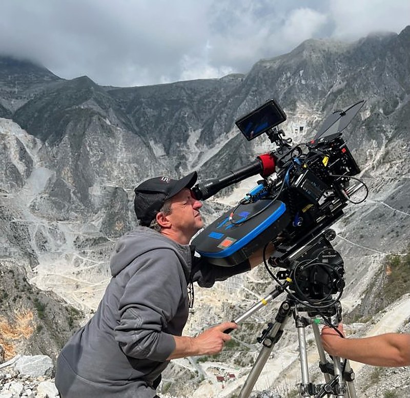
- One Battle After Another. Image and technical information sources: British Cinematographer. Credits as indicated by the source: Michael Bauman / Courtesy Warner Bros. Pictures.
- The Brutalist. Image source: British Cinematographer. Credit as indicated by the source: Bence Szemerey.
- 2001: A Space Odyssey. Image source: American Cinematographer / ASC.
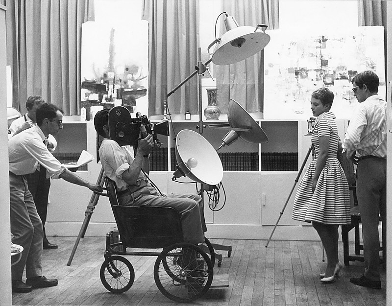
- À bout de souffle. Photograph by Raymond Cauchetier. Source: Flashbak.
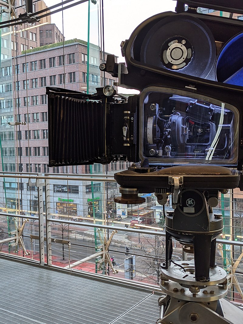
- Arriflex 35 IIC with Blimp 300. Author: SunOfErat. Source: Wikimedia Commons. License: CC BY-SA 4.0. Image resized to 800 px wide.
- Sinners. Film-format and stock information: Panavision / American Cinematographer references cited in the related ON FILM & DIGITAL review.
ON FILM & DIGITAL
© Ignacio Aguilar, 2026.
The Author
Ignacio Aguilar is available for cinematography work, creative collaborations, lectures, workshops and international projects. He is a Sony Independent Certified Expert (ICE) and Cooke Optics Spanish Ambassador for Cooke SP3 lenses. Contact here.